
Frode
Elite
Customer
Verified licence
8 add-ons
BoardGameHub
Emporium Client
GameHub
GroupFlair
Journey
Level
Plans
XenStaff
Many of these will also apply to the GameHub main addon 
1) Can this be removed or hidden? For SEO maybe it’s OK to keep? But it steals vital space at the top. Especially this is important in regard to mobile, as you don’t want too many unnecessary things to take up valuable space at the top of their screen before the main content. The breadcrumb is OK, but no need for the intro text to be visible, don't you agree?
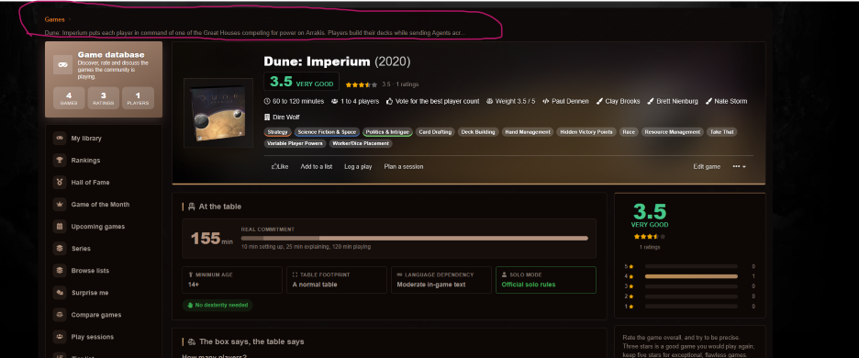
Same with this:
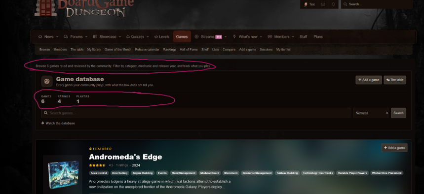
The info text. Then the “games, ratings, players” is already listed in the sidebar below. So, we can save space and remove it from the search bar.
Keep the one in the sidebar: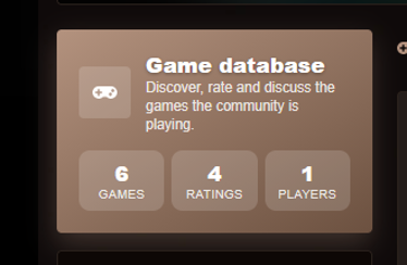
2) Recent plays:
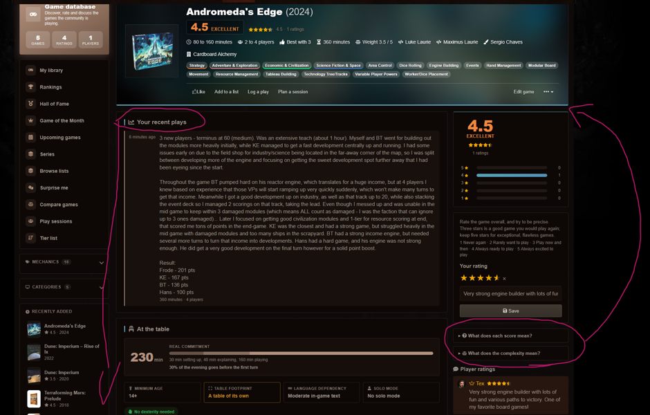
I would move the score info boxes up to the top of the “sidebar”. I want it to be more visible for the users. They are still hidden by default.
And as you see with my long recent play log, it takes up a lot of space on the page. Literally all the screen on mobile view ^^. It is probably better that the more important information is viewed first.
So “At the table/the box says…” is first, then recent plays, then before you play and so on. If there are many more recent plays (which there hopefully will be!) or they are long, like mine - maybe a collapse/expand option at X characters? Or something that allows users to browse between them without reloading the whole page.
Add the ability to be able to edit the plays log?
3) Featured widget on Games front page: Remove the “add a game” button. It is already at the top of the page, and it looks very odd on mobile view. Also, could you add the option to “feature a game”? Default XF function. (for those with the permission to do so).
4) Copy field (to copy the content from the base game) when adding expansion/stand-alone expansion does not appear. Bug?
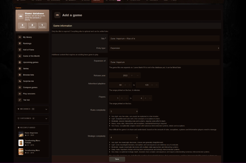
5) Improvement to the base game / expansion links:
There are a few metrics that I see will be challenging in terms of not providing the best data set to the reader. As often, many expansions (especially small ones) are rated and viewed both individually but also together with the base game. Most traffic is usually found on the base games, and many just rate the base game, with already all their expansions also in mind (since that’s what they own). This will sadly muddle the ratings for the game, as some will do it correctly (rate the base game objectively alone) and some will rate with several expansions in mind.
Mockup of the design:
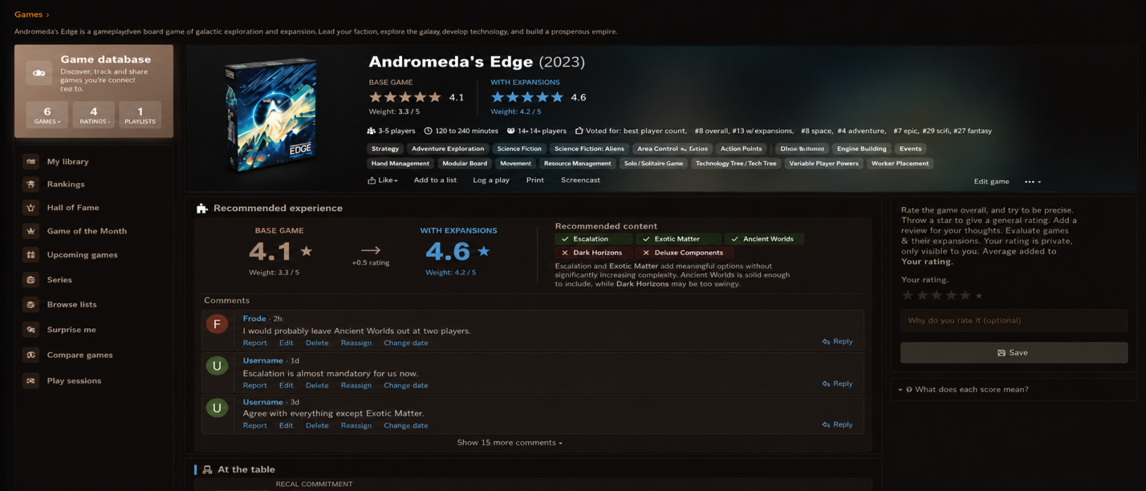
5a) Base game page:
I would divide the top game bar into Grade & weight for base game, and then grade & weight for optimal experience with expansions.
I think to boost the usability of the database, a new module should be used: “Recommended Experience with expansions”. Condition: If_expansion OR expansion_standalone: Show module. Do not show with revised edition, as that is basically a new rendition of the original game, and generally old content is not compatible anymore with it. So, there is no need to show this if no expansions have been added to the database. It should be the top module on the page, right below the header. Before “at the table” and “the box says”. See mockup for suggestion
The module would include the full details for what was teased in the header (which was just the actual grade and weight):
Best score/weight for base game (as today) & best score/weight for “base game + expansions”. Below it, it will list the expansions the user has added to this “optimal score”. Example: Expansion A, B, D, but NOT C. A nice way to show it would be a list of all the expansions the game has, and a green check-mark or red X cross next to the expansions included in the optimal score. There is also a text field so the user can provide an explanation for his choices.
Would also be super cool if below this, there was a small comment field where users could drop their comments! These are very trimmed in layout (do not include the full user area with group banners etc etc, to save as much space as possible). Just name, date and small avatar. A max of 3 comments are shown before you have to expand the next section. This comment section can also collapse once you are done browsing. The default is show = 3.
Grade for this score can be down or upvoted, like the “rules people get wrong” or “house rules”. Only the top suggestion will show, you have to click “next” to view other alternatives (if any) to the optimal combination of expansions.
This is because for many base games that have lots of expansions, rarely is anyone going to play that game alone without some of the expansion content. And usually (but not always!), they improve the content in the base game. The same can be said for Gamehub and PC games, when new expansions are released!
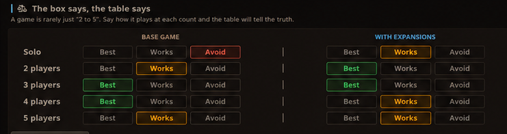
Similar to your module “At the table”, this would be very relevant to provide. We could also provide the setup/teaching time and optimal player counts of the two experiences, as that could differ substantially. If it does not (result is the same), it could just show the base game table.

5b) Expansion & stand-alone expansion page:
Almost untouched. Just would be useful with a reminder on the expansion page: "The suggested weight, setup/rule time, is based on explaining/complexity of the expansion content only. For example, if the setup time for the expansion is 10 minutes, that means the expansion simply adds 10 min to the total setup time for the game".
1) Can this be removed or hidden? For SEO maybe it’s OK to keep? But it steals vital space at the top. Especially this is important in regard to mobile, as you don’t want too many unnecessary things to take up valuable space at the top of their screen before the main content. The breadcrumb is OK, but no need for the intro text to be visible, don't you agree?
Same with this:
The info text. Then the “games, ratings, players” is already listed in the sidebar below. So, we can save space and remove it from the search bar.
Keep the one in the sidebar:
2) Recent plays:
I would move the score info boxes up to the top of the “sidebar”. I want it to be more visible for the users. They are still hidden by default.
And as you see with my long recent play log, it takes up a lot of space on the page. Literally all the screen on mobile view ^^. It is probably better that the more important information is viewed first.
So “At the table/the box says…” is first, then recent plays, then before you play and so on. If there are many more recent plays (which there hopefully will be!) or they are long, like mine - maybe a collapse/expand option at X characters? Or something that allows users to browse between them without reloading the whole page.
Add the ability to be able to edit the plays log?
3) Featured widget on Games front page: Remove the “add a game” button. It is already at the top of the page, and it looks very odd on mobile view. Also, could you add the option to “feature a game”? Default XF function. (for those with the permission to do so).
4) Copy field (to copy the content from the base game) when adding expansion/stand-alone expansion does not appear. Bug?
5) Improvement to the base game / expansion links:
There are a few metrics that I see will be challenging in terms of not providing the best data set to the reader. As often, many expansions (especially small ones) are rated and viewed both individually but also together with the base game. Most traffic is usually found on the base games, and many just rate the base game, with already all their expansions also in mind (since that’s what they own). This will sadly muddle the ratings for the game, as some will do it correctly (rate the base game objectively alone) and some will rate with several expansions in mind.
Mockup of the design:
5a) Base game page:
I would divide the top game bar into Grade & weight for base game, and then grade & weight for optimal experience with expansions.
I think to boost the usability of the database, a new module should be used: “Recommended Experience with expansions”. Condition: If_expansion OR expansion_standalone: Show module. Do not show with revised edition, as that is basically a new rendition of the original game, and generally old content is not compatible anymore with it. So, there is no need to show this if no expansions have been added to the database. It should be the top module on the page, right below the header. Before “at the table” and “the box says”. See mockup for suggestion
The module would include the full details for what was teased in the header (which was just the actual grade and weight):
Best score/weight for base game (as today) & best score/weight for “base game + expansions”. Below it, it will list the expansions the user has added to this “optimal score”. Example: Expansion A, B, D, but NOT C. A nice way to show it would be a list of all the expansions the game has, and a green check-mark or red X cross next to the expansions included in the optimal score. There is also a text field so the user can provide an explanation for his choices.
Would also be super cool if below this, there was a small comment field where users could drop their comments! These are very trimmed in layout (do not include the full user area with group banners etc etc, to save as much space as possible). Just name, date and small avatar. A max of 3 comments are shown before you have to expand the next section. This comment section can also collapse once you are done browsing. The default is show = 3.
Grade for this score can be down or upvoted, like the “rules people get wrong” or “house rules”. Only the top suggestion will show, you have to click “next” to view other alternatives (if any) to the optimal combination of expansions.
This is because for many base games that have lots of expansions, rarely is anyone going to play that game alone without some of the expansion content. And usually (but not always!), they improve the content in the base game. The same can be said for Gamehub and PC games, when new expansions are released!
Similar to your module “At the table”, this would be very relevant to provide. We could also provide the setup/teaching time and optimal player counts of the two experiences, as that could differ substantially. If it does not (result is the same), it could just show the base game table.
5b) Expansion & stand-alone expansion page:
Almost untouched. Just would be useful with a reminder on the expansion page: "The suggested weight, setup/rule time, is based on explaining/complexity of the expansion content only. For example, if the setup time for the expansion is 10 minutes, that means the expansion simply adds 10 min to the total setup time for the game".